 iTunes 7 breathed some new life into the iTunes, which has been slowly evolving since its preliminary days. But the more and more I experiment with the new version of iTunes, I get a feeling that is like beta software that needs a few more tweaks for it to be ready for public use. Reverse syncing, CoverFlow view, automatic album artwork downloading, iPod upating within iTunes, a new iPod/Devices information window, and a new organized sidebar are long-awaited additions to iTunes, but I question many of the changes Apple has decided to take with the new version of iTunes and wonder if they will decide to re-implement some of the old features found in previous version of iTunes.
iTunes 6 was a lean, mean music machine, and Apple has taken iTunes 6 and somewhat cluttered it with bulk and extra features. Many are reporting major differences in speed from iTunes 6 and iTunes 7. I honestly can’t say that I have seen a significant drop in performance, but I have experienced a few bugs and annoyances that will likely be fixed in the next update or so.

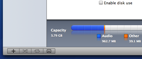
iTunes 7 changed one of the biggest things I liked about iTunes 6, which was the graphical user-interface. If I were to describe the iTunes 7 GUI in one word, I would say “Web 2.0ish”. Just take a look at the new iPod information window that comes up when you connect your iPod or iTunes-compatible device and you see what I mean. The entire Aqua UI that has existed since the first days of Mac OS X has almost completely disappeared from iTunes. iTunes 7 takes on a new flatter, Web 2.0ish look with a gray and blue color scheme. I don’t believe it is quite up there with Aqua, but the new look is refreshing. Change is always good, but this new look isn’t quite there yet. A few more tweaks, maybe some brighter colors and some opaque windows and toolbar, maybe this GUI will turn out to be the one that will eventually replace the Aqua UI that we use today.
Version 7 is the biggest update to iTunes that I’ve seen since 4.7, when iTunes introduced support for podcasting back in Summer 2005. I don’t think iTunes 7 is quite ready for prime-time, but I do think it is an excellent foundation that Apple can improve on. Many probably won’t completely appreciate the new features and benefits that iTunes 7 comes with until it becomes as fast and stable as iTunes 6, but nothing a simple software update can’t cure.
What’s your opinion on the new iTunes 7?

3 Responses
pluto198 says:
I have nothing bad to say about iTunes 7. Built-in Cover Flow is amazing. The ability to get cover art from the iTunes Store within the iTunes app itself is handy. Gapless playback is better than ever (better than setting crossfade to 0, which kind-of worked). The detailed info view I get when I plug in my iPod is also nice. I miss aqua, but I love all of the new features of iTunes 7.
September 16th, 2006 at 10:20 pm
Appleology | iTunes 7 keyboard shortcuts says:
[…] « My take on iTunes 7 […]
September 17th, 2006 at 7:42 am
jamie says:
I like some of the new feuture, but when i first started the program i imdiatly started to miss the old look, i think i may have even compained out loud about it!
I do like the Cover Flow, but i had to spend hours today making it work as it doesent reconise alot of my music.
^licks^
jammie & lion
September 28th, 2006 at 1:38 pm
Leave a reply